Microsoft Rewards
Product Vision: Microsoft Rewards Identity


Product Vision: Microsoft Rewards
Not many people are familiar with the Microsoft Rewards program, which is no surprise. The rewards program hasn’t been appropriate to introduce to the user. The rewards medallion icon was the only visual repetition. Confusing and difficult was general user feedback. It's time to rethink and redesign it.
As Rewards team visual lead, I worked with the Microsoft Marking team. Define the value prop and repositioning the brand.
—
Microsoft Rewards is a loyalty program proving the best value and experiences to its most loyal fans delivered by the most trusted company (in tech).
WE PROMISE:
User Microsoft products to help you be more, achieve more, learn more, and receive more.
DEFINE THE GOAL:
Leverage the strength and reputation of Microsoft.
Look and feel like a Microsoft ”relationship enabler” – a program aimed at forging strong emotional ties with our customers. Move the program mental model from pay-to-play to true loyalty. Help customers discover and utilize Microsoft products: grow DAU on multiple endpoints.
Bring clarity consistency to the Rewards product portfolio
Keep earn opportunity fresh and interesting to promote habitual engagement
Have a comprehensive core rewards experience (Rewards main dash)
EARLY EXPLORATION:
Started with the original Rewards Medal, I explored different colors and various abstract concepts. Here are some process examples.


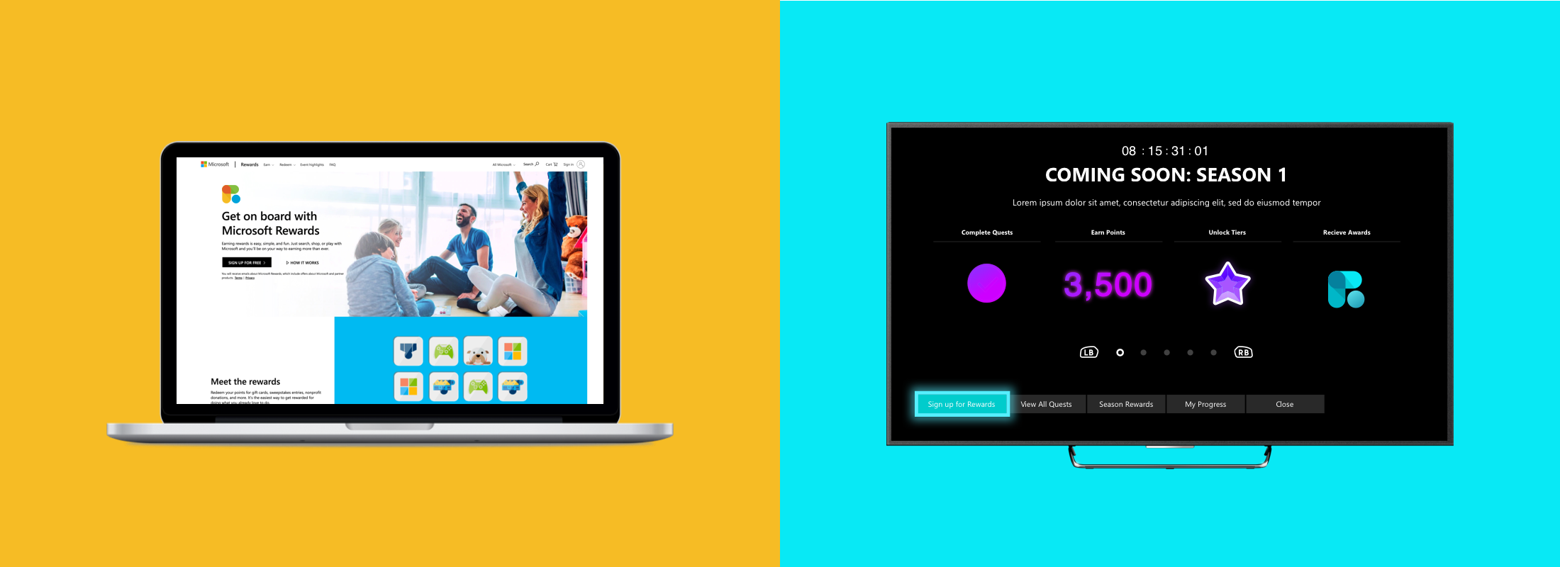
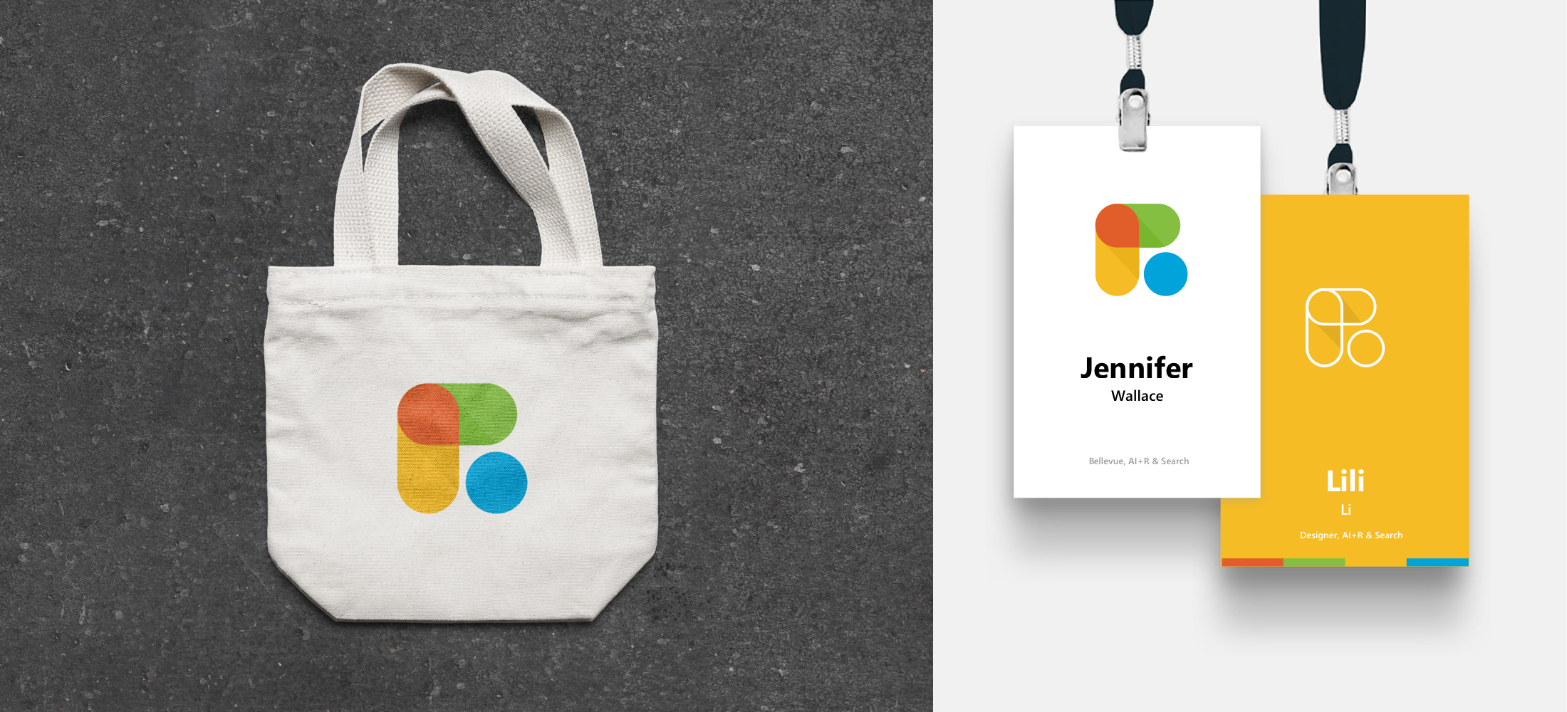
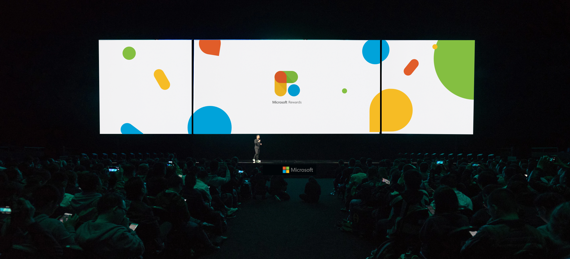
I created a system that extends the identity to subbrand to UI elements. Seamless apply from digital canvas to the physical environment.


Extended the visual components to User Interface symbols. Such as conversation bubbles, notification messages, and loading motions.


